
Put the whole world on one screen, on your own laptop
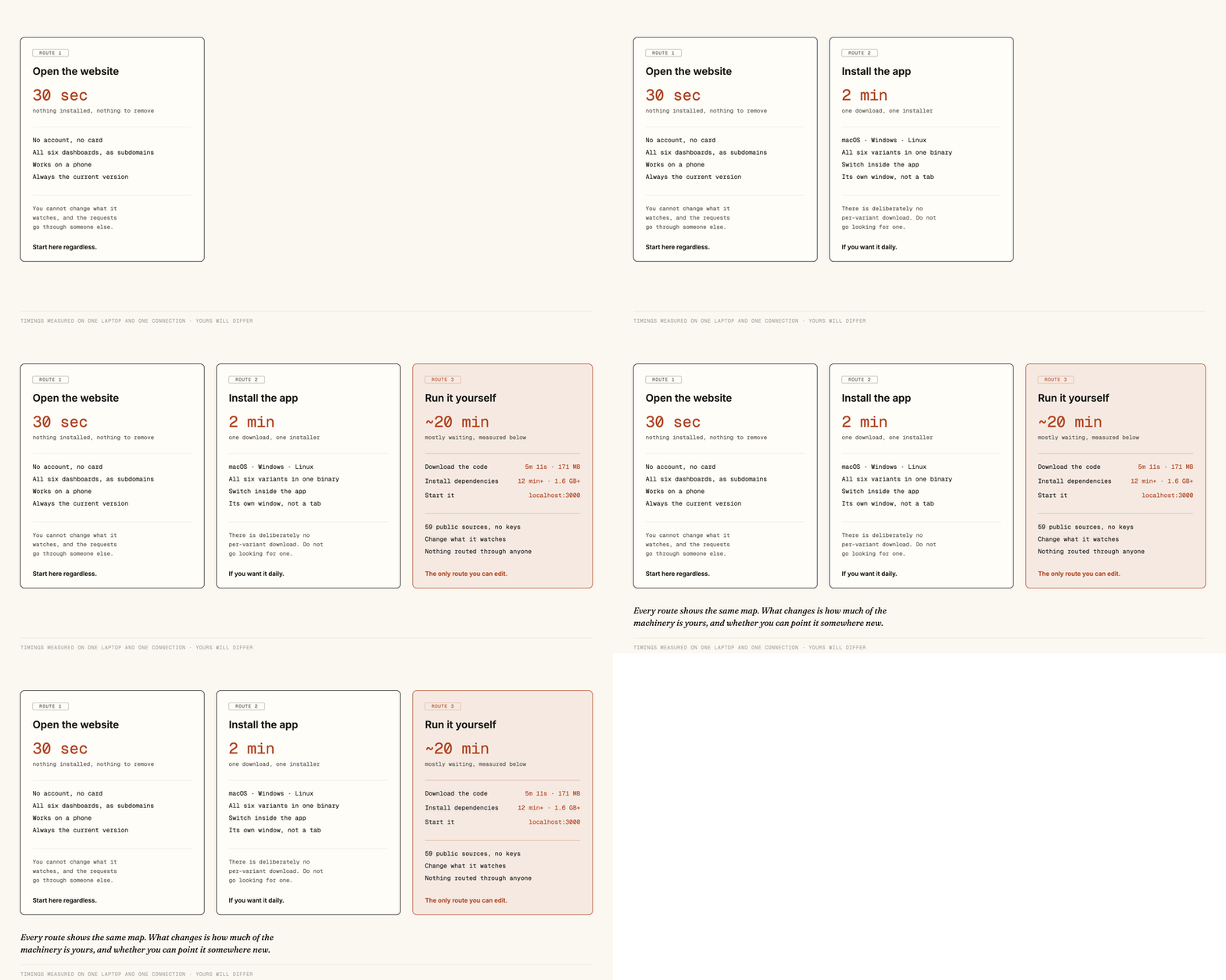
There is a free, open dashboard that shows earthquakes, conflicts, markets, ships, flights and the day's news on one live map. You can open it in a browser in thirty seconds, install it as a desktop app in two minutes, or run the entire thing yourself with no account and no API keys. Here is what each route costs, measured, and which one you actually want.
Most of what you know about the world arrives one story at a time, chosen by someone else, already framed. There is a free and open alternative that puts the raw signals on one live map instead: earthquakes as they are recorded, conflict events, market prices, ships, flights, outages and the day's news from a dozen outlets side by side.
It is called World Monitor, and the useful part is that you are not renting it. You can open it in a browser in thirty seconds, install it as a desktop app in about two minutes, or run the whole thing on your own machine where nothing is behind an account and no key is required.
This issue is the walkthrough for all three. I timed the slow steps on my own laptop rather than repeating the numbers in the README, and I checked the instructions against the code, which is how I found the one place the official guide will send you to a dead address. By the end you will know which route fits you and roughly what your evening looks like.
What it actually shows
One map, many layers. Earthquakes from the US Geological Survey, wildfires, storms and weather. Conflict events and military movement. Stock, commodity and crypto prices. Shipping and flights. Undersea cables and power outages. News from the BBC, the Guardian, NPR, Al Jazeera, CNN and others, grouped and cross-referenced rather than listed.
The idea that makes it more than a wall of gauges is that it looks for signals appearing together. An earthquake near a shipping chokepoint at the same time as a jump in a commodity price is a different thing from either alone, and the map draws that connection rather than leaving it to you.
Route 1: open it in a browser
Go to worldmonitor.app. That is the entire instruction. No account, no trial, no card.
There are six of these, and they are separate dashboards rather than filters on one. The main one watches the world. tech follows AI labs, funding and layoffs. finance watches exchanges and commodities. commodity tracks minerals and crops, energy grids and fuel, and happy shows the same world with only the good news left in, which sounds like a joke and is quietly the most-used one in my house.
Spend ten minutes here before doing anything else. If the thing does not interest you at a glance, the other two routes will not change that.
Route 2: install the desktop app
If you want it as a window rather than a tab, there are signed builds for macOS, Windows and Linux on the releases page.
One detail that saves confusion: there is deliberately no per-variant download. You install one app and switch between world, tech, finance, commodity, energy and happy inside it. I checked the download links from the site and they redirect to the current release binaries, so grab whichever matches your machine.
Route 3: run the whole thing yourself
This is the interesting one, and the only route where you can change what it watches. Everything below I ran on a MacBook Air, and the numbers are what I measured rather than what the docs promise.
Before you start, know the shape of it: this is not a small install. Expect around ten to fifteen minutes of mostly waiting, and a couple of gigabytes of disk. Nothing here asks for a key, an account or a card at any point.
Step 1: check you have Node
Node is the runtime the project is built on. In a terminal:
node --versionIf that prints nothing, install Node from nodejs.org first. The project pins version 24 in its own config and its contributor instructions say to use 24, so take that one rather than whatever you happen to have. Nothing in the project declares a hard minimum, which means an older Node will not warn you, it will just fail somewhere less obvious.
Step 2: download the code
git clone https://github.com/koala73/worldmonitor.git
cd worldmonitor
That took 5 minutes 11 seconds on my connection and left 171 MB on disk. It is a big repository with a lot of history, so if it looks stalled at first, it is not.
Step 3: install the dependencies
npm installThis is the long part, and the one nobody warns you about. I stopped watching at twelve minutes, by which point it had pulled down 1.6 GB and was still going, because the project carries a 3D globe engine, a WebGL map renderer and a browser-side machine learning runtime. Budget fifteen minutes and two gigabytes, start it before you make coffee, and do not worry when it prints nothing for minutes at a time. That is normal for this one.
Step 4: start it
npm run devThen open http://localhost:3000 in your browser.
You should see data without having set a single key. The reason is in the project's build config, which I read rather than took on faith: the development server forwards your requests straight through to the public sources, with 59 upstreams wired up by hand. Among them the USGS earthquake feed, the RSS from the BBC, the Guardian, NPR, Al Jazeera, CNN, Hacker News and Ars Technica, Yahoo's market quotes and the prediction markets. None of those ask who you are.
Step 5: switch dashboards
The same folder runs all six. Stop the server with Control-C and start a different one.
npm run dev:tech       # AI labs, funding, layoffs
npm run dev:finance    # exchanges, commodities, crypto
npm run dev:commodity  # minerals, crops, chokepoints
npm run dev:energy     # grids, oil, gas, nuclear
npm run dev:happy      # good news only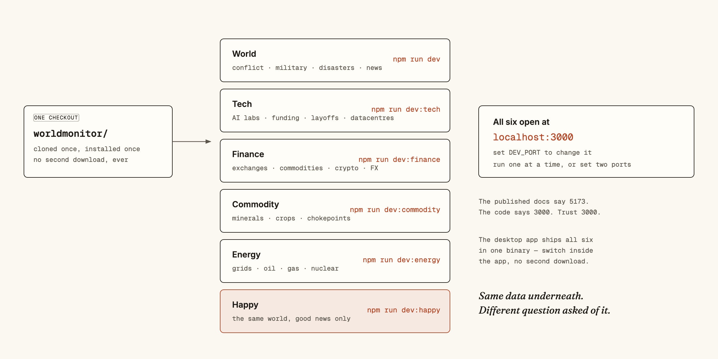
What you get before signing up for anything
The honest answer is: most of it. Earthquakes, weather, natural events, world and tech news, market and crypto quotes, prediction markets, displacement figures, submarine cables, government spending and cyber indicators all arrive with no account anywhere.
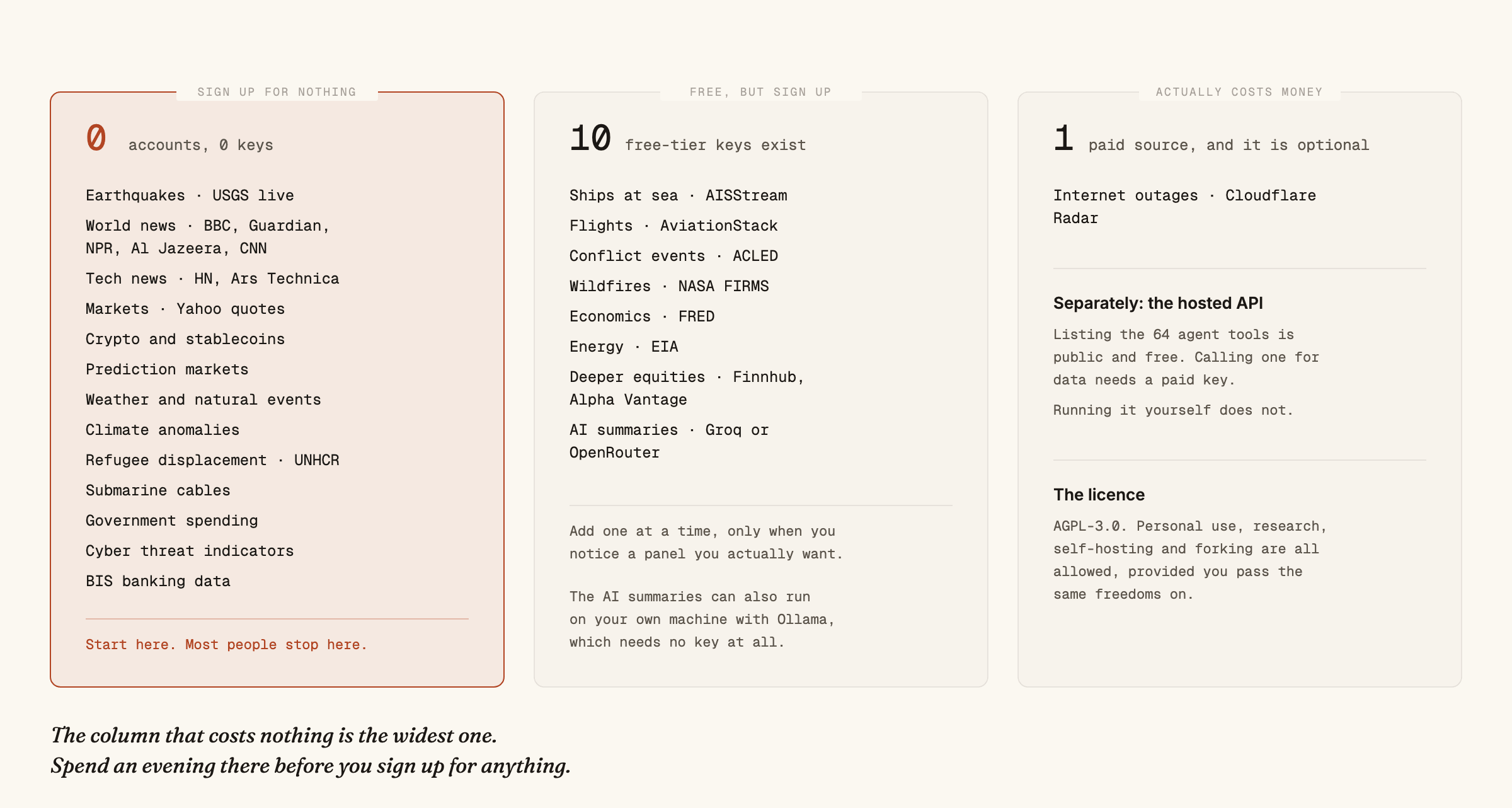
If a particular empty panel starts bothering you, add that one key and no others. Ships need a free AISStream account, flights need AviationStack, conflict event data needs ACLED, wildfires need NASA FIRMS. Each is a free signup, and the project reads them from a local file it never commits.
The AI summaries are the exception worth knowing about, because they have a third option. They can run through Groq or OpenRouter with a free key, or entirely on your own machine through Ollama, in which case the text never leaves your laptop and there is no key at all.
If you use an AI assistant
The project publishes a command-line tool, and listing what it can do needs no key and no install:
npx worldmonitor toolsThat returned 64 tools when I ran it, covering country risk scores, conflict events, market data, cyber threats, chokepoint status, supply chains and more. It is a genuinely interesting list to read even if you never call one.
Be clear-eyed about the split, though, because the wording around it is easy to misread. Listing the tools is public. Actually calling one against the hosted service needs a paid key, and you will get a blunt Authentication required if you try without one. Running the project yourself, as in route 3, has no such gate. That is the trade: convenience costs money, and your own machine costs an evening.
When to skip all of this
If you want a daily briefing rather than a live map, this is more machinery than you need, and a good newsletter will serve you better.
If you are on a metered connection or a nearly full drive, stay on route 1. Two gigabytes for a dashboard you might glance at twice is a bad deal, and the website is the same software.
And if you were hoping for a private intelligence service, adjust the expectation. Everything here is public data, gathered well and drawn on one map. The value is entirely in the gathering and the arrangement, which happens to be most of the value in intelligence work anyway.
What I want to try next
The part I keep coming back to is the connection-drawing: the map noticing that two unrelated signals moved together, and saying so.
I do not yet know how much of that is genuine and how much is the pleasing shape of coincidence, because a system watching a few hundred live feeds will always find pairs that moved at the same time. That is not a criticism of this project so much as the central hard problem of the whole field, and it is testable: log what it flags, wait, and score it.
So that is what I am setting up, on the route 3 copy running on my own machine, where I can see every input. If you get there first, tell me what you found, because I would rather learn it from you than from my own small sample.
— Zulqarnain
Get the next one
New teardowns as they land. Prompts, costs, and the parts that didn’t work.
Free forever. Unsubscribe in one click.